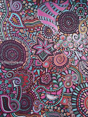
Metallic Doodle Mosaic

Well, the year is coming to a close. I haven't been able to get in my studio for two months since I've busy with an art teaching job, subbing for an art teacher at a nearby school who went on maternity leave. I had forgotten how much time it takes to teach all day and then lesson plan all evening--and keep up with two college classes to boot (not to mention the household stuff!). I do hope that recent teaching experience will help to land me a full time job this coming school year--fingers crossed. It was a great experience! But the sub job ended on the 22nd so I finally have a little free time again. 

That being said, I still haven't made it into my studio, but I do have plans do that by next weekend. I'm itching to paint, although my studio is such a mess I may end up cleaning it before I get to paint anything! C'es la vie. 

For now, I somehow manage to do a little doodling just for fun on the couch over the weekend. This is nothing spectacular, but I sometimes just being able to doodle a little bit will satisfy my creative cravings. So here is my Metallic Doodle Mosaic, done with just metallic colored pencils and a little white, on black paper. 

Metallic Doodle Mosaic Drawing

It actually looks better in person than it does in this photo. It is challenging to photograph metallic pencil at times. But you get the idea.

Hopefully my first post of the new year will feature a new painting! In the mean time, I hope you all enjoy what's left of your 2015, and may your new year be filled with many blessings...and lots of creative time!

A Lovely Rose

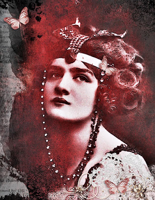
I was in the mood to create some digital art over the weekend. I had planned to get into the studio, since I've been doing so much school work lately that I haven't been in there much. But time got away from me, as it tends to do at times. But since I still wanted to create *something,* I decided to do a little digital magic late last night, starting with a vintage photo of Lily Elsie and see where it led me. This was the result.

A lovely Rose Lily Elsie

This was created with a combination of PaintShopPro and PhotoScape. Lots of layers of images here and various filters to create the final image. Thanks to the lovely rose herself, Lily Elsie, who inspires a lot of my digital art.

Art Surrender

Just sharing a favorite art quote for your Friday.

Art Surrender

Rainy Day Fairy

It's not raining, but I must have been thinking about the rain...and fairies, when I created this Rainy Day Fairy Art digital art. Every now and then a fairy has to make an appearance in my artwork (digital or otherwise), or I don't feel quite like myself. :) 

Rainy Day Fairy Art

You may recognize the lovely Lily Elise, who was the vintage photo inspiration for this piece. She makes regular appearances in my artwork. She was quite lovely, don't you think?

Hope this fairy art brings a little magic to your day, as it did to mine.

Sunflower Friendship Mixed Media

I made a special mixed media painting for a very dear friend recently. I waited to post it until she'd received it, and now that she has I want to share it with all of you. My friend, Connie recently moved into a new home in Tennessee, and she loves sunflowers. So this was created especially for her.

Sunflower Friendship

I used lots of torn scrapbook paper, acrylic paints and paint pens, stencils, and some paper elements too. I always love making things for other people. It seems like the paintings I love the most are the ones I make as gifts for friends and family. Connie says that she has a sunflower-themed guest room, and that is where this painting will go. I hope it brings a little sunshine to everyone who sleeps in that room. :)

Red Lily Digital Art

Since I've been working on school work a lot lately, I haven't been in the studio much. Hoping to rectify that this weekend. But in the mean time I felt like some digital creative fun, and I ended up creating this Red Lily digital art.

Red Lily

Lily Elsie is one of my favorite vintage beauties, and she is always a wonderful muse for my creativity. And for some reason I'm really into red lately, so this digital art has a lot of red in it. Hope you like it!

Blessed Mixed Media

I have been doing so much genealogy in the past year and I have a couple of antique photos of ancestors that I really love. One of them inspired me to do this painting, Blessed. I only have a photocopy of this photo, rather than the original. But I can't tell you how much I love it! It is a photo of my great, great grandmother, Susan Eleanor (Templeton) Kephart. And in the photo she is holding my great grandfather, John Arthur Kephart. It was taken probably in late 1878, since my great grandpa was born in September of 1878. Susan would be 19 years old in this photo.  I made an extra copy of the photo and decided to do a mixed media painting with it.

Blessed Kephart

This painting involves lots of layers of acrylic paints, stencils, stamping and various sorts of found-object printing...and a lot of torn scrapbook paper too. I kept the colors very neutral, because I thought that gave it a more vintage feel. It took me a while to decide if this was finished...sometimes I just can't decide if I want to add more or not. I am going to add a light layer of varnish to this to seal it, and then it will be hung in my home somewhere.

I've learned so much about Susan Kephart in the last year or so. She was an amazing woman! She was profiled in Farmer's Wife magazine in 1912, as she and her husband, Alexis Elihu Kephart were prominent and successful farmers in Oklahoma. She won many awards for her farm produce, one time even winning $75 in gold for having the largest exhibit of fruits and vegetables displayed by any one person and raised on their own farm--hers numbered 200! She won that award in 1911, and I have to think that $75 in gold was a big deal back in the day. I am proud to be descended from this wonderful woman, and I only wish I could have known her.

Mail Call Digital Art

This week's Digital Art challenge over at the Digital Whisper blog has the theme, Mailbox. As soon as I read that I knew what photo I would use as my inspiration for this digital art project. It's a photo of my mom when she was a young girl, checking the mail. So this is what I created for that challenge.

Mail Call


Mom's favorite flowers were daisies, so I had to add some of those to the piece too. An old postcard serves as the background, along with some little splashes of color here and there.

Masked TVD Digital Art

I'm still in Digital Art mode as I try to finish up a mixed media painting in the studio as well. This art piece is inspired by The Vampire Diaries characters, Katherine and Stefan--and the scene where they attended a masked party. And since they're vampires, I threw a little blood into the mix. 

Masked TVD

Red is so dramatic, but so perfect for vampires! In case you're wondering, I use Paint Shop Pro and PhotoScape to create my digital art. It's a great way to let me get a creative fix in when I may not have time for the studio, or just when I feel like being creative with the mess. :)

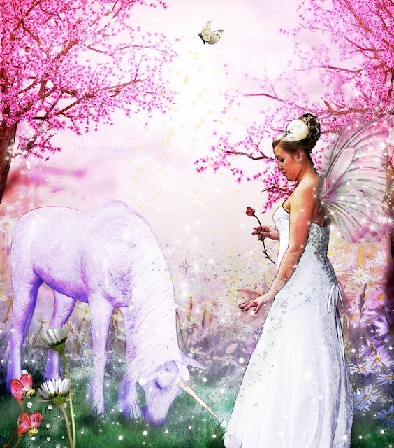
Wedding Fairy Digital Art

Since I've been getting back into my Digital Art again, I thought I'd do something fun--so I turned one of my daughter's wedding photos into fairy art! I just love fairies. So what could be more fun than turning my daughter into one? :)

Wedding Fairy

A unicorn, some flowers, an enchanted setting, and a little fairy dust, and my daughter is a fairy. Fun, fun, and more fun to create!

Michael Jackson Red Paint

I felt like creating some Michael Jackson digital art today. So, when the muse strikes, I follow it. And today I also felt like going very, very red. So this is what you get when you get "Michael Jackson in red" stuck in your head!

Michael Jackson Digital Art

Now I think I feel the need to turn on some Bad era Michael Jackson tunes on and get my groove on. Just Blame it on the Boogie, if you must.

Vampire Diaries Eclipse

I haven't made any digital art with The Vampire Diaries theme for awhile. I miss that show over the summer when it's on hiatus! Since I was thinking about it today I thought I'd make some TVD-themed digital art to share. I know I have a few followers who love TVD, so I hope you like it.

Vampire Diaries Eclipse


This is based on the moment that Damon and Bonnie see the eclipse for the first time. I love the moody feel of the red color scheme. A touch of feathers represents Bonnie, and a bit of blood to represent my favorite vampire, Damon. 

I'm anxious to see what next season will bring on TVD, especially since Elena will be gone. I'm not thrilled with that, but I've watched this show from the beginning and I will watch it until its end!

Circles and Waves

Destiny and I were experimenting with stencils recently to make paintings. We started this one off with just stencils and paint sprays and didn't much care for it when it was finished. So we decided to see if we could turn it into something we did like, and this is the result--our Circles and Waves mixed media painting.

Circles and Waves

The background was mostly red, yellow-orange, and pale blue paint sprays over stencils. Then we added more stenciled shapes using acrylic paints. Then we added the stenciled waves with black paint, and also added the yellow-orange circles using round foam stamps. A cardboard tube was used to add the white rings with acrylic paint. Then I drew on this cross-hatched designs, and we stamped on the black circles with text in them and a few other small details with paint marker.

I definitely like this after adding all the extra stuff to it. Destiny wasn't thrilled with the colors in the end, but she had a good time making it, so I count that as a win.

Day at the Beach DIgital Art

Since I was doing some Digital Art yesterday, I decided to jump in on the most recent creative challenge over at the Lunagirl Moonbeams blog. The theme for this week is Retro Summer, so this is what I created for that challenge.

Dat at the Beach

I used a Vintage Photo and lots of image layering to create this digital art. Looks like it was a beautiful day at the beach, don'tcha think? :)

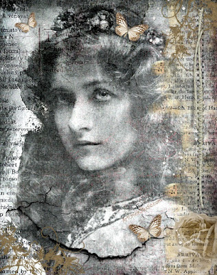
Mad for Maude Digital Art

I felt like creating some Digital Art for this evening, just for the fun of it. I used a vintage photo of Maude Fealy for my inspiration. Her beauty is always timeless and inspiring. Hope you enjoy it as much as I enjoyed creating it. 

Mad for Maude

I hope you find some creative inspiration today as well! :)

Laundry Day Digital Art

This week's challenge over at the Digital Whisper blog features the theme, "Clothespins." I knew I'd be using an old family photo to create my digital art piece for this challenge, and this is what I came up with.

Mom and Nana Laundry Day

This features a vintage photo of my mother when she was about two years old, helping my grandmother (whom I called, Nana) hang laundry on the clothesline. If you look closely you can see that my mother has a clothespin in her mouth. I've loved this photo for awhile and want to put it in my laundry at some point. It makes me smile whenever I see it. 

I miss both of them. So much.

Learn Play Grow Canvas Trio

I recently finished a set of three canvases for a dear friend who runs a childcare center from her home. She just recently moved and got a brand new, larger space for the kiddos and she was in need of something for the walls. So I created this canvas trio for her to help fill up the blank walls. 

Learn Play Grow Acrylic Painting

These were a surprise for her and they just arrived to her in California yesterday, so now I'm able to post the pics here on the blog. She really liked them and I'm so glad! I love making art for someone and it makes them happy. :)

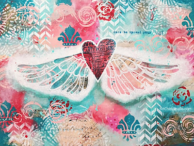
Dare to Spread Your Wings Mixed Media

This week's project in the studio was created as a result of an online class I took with artist, Ivy Newport. I love her style of art, and I love learning new techniques from other other artists. So when I saw her class posted on Facebook I decided to take it. The class is called 'Wing It.' 

Dare to Spread Your Wings

This project involved collage, paint, and stenciling and it was really fun to do! 

If you're interested in taking Ivy's class you can find all the info you need about it, along with how to sign up at the link below:


Don't Forget to Fly Art Journal Tutorial

Since I haven't posted any tutorials for awhile, I thought I'd create one for you. So while I was in the studio over the weekend, I decided I'd make it an art journal tutorial--since I was going to be creating a new spread anyway and using some new fun supplies to boot. Who doesn't Love (with a capital 'L') new art supplies, right?! And all the more artsy fun to use them in my art journal.

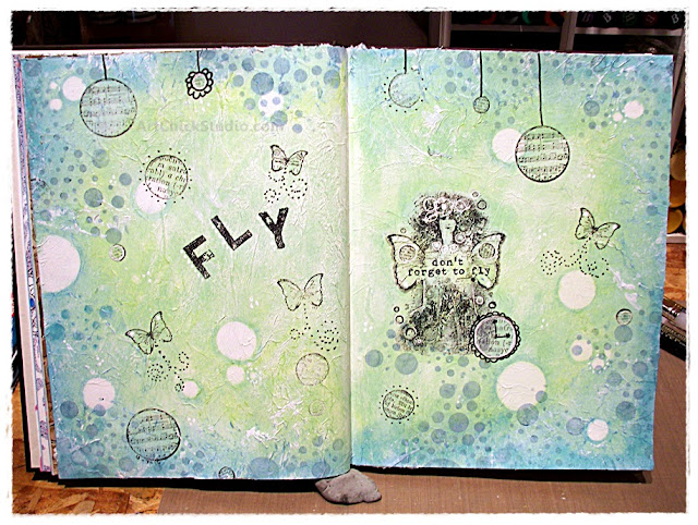
Sooooooooo--this is the 'Don't Forget to Fly' art journal spread that I created, along with the fabulous new (and not-so-new) art supplies that I used in the process.

Don't Forget to Fly

Artsy Materials: Faber-Castell Gelatos (Snow Cone and Kiwi colors), Prima Finnabair Elementals 'Bubbles' Stencil, Prima Finnabiar 'Don't Forget to Fly' Cling Stamps, Tim Holtz Distress Ink (Faded Jeans color), Stayz-On Ink (Black), Faber-Castell Pitt Pen (Black), Uni-Ball Signo UM-153 Gel Pen (White), white acrylic paint, Liquitex Gesso (White), Liquitex Matte Medium (Fluid), and Tissue Paper (not shown). Oh, and I'm also using a Strathmore 500 Series Mixed Media journal; it is hard-bound and has 90lb paper pages that are deliciously smooth and perfect for the mixed media journaling that I love to do [and makes me feel like a real artist when I use it, ahem].

I will preface this all by saying that I had no real plan for this art journal spread when I began--other than that I was going to use my new cling stamps, and some Gelatos. Most of the time when I'm art journaling, I like to fly by the seat of my pants...which seems appropriate for the theme of this spread anyway. :)

Artsy Deets...OK, let's get this art show on the road!

1.  Gesso the pages. I almost always gesso my pages if I'm doing mixed media. If I were doing watercolor or just simple drawing, I'd leave them as is. But I wanted the pages to be ready for whatever I might do here, so I gesso'd [that's right, I just used 'gesso' as a verb--I'm crazy like that]. And that's what you see here in the photo--two primed pages, ready for anything. I also used my heat gun to speed up the drying process on the pages. What can I say? Patience is not one of my strong suits.

Gesso'd Page

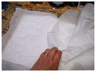
2.  Crumple up the Tissue Paper and adhere to the pages with Matte Medium. I decided I wanted TEXTURE on these pages. And I love to use tissue paper to add texture! So, in the next few pics that's what you see--the crumpling process, and the adhering process. And again, I sped up the drying process with the heat gun.

Crumple.
Tissue Paper pages
 Add Matte Medium to the pages.
Matte Medium pages
Add tissue and then add Matte Medium over it.
This ensures the tissue is well-adhered to the page.
Matte Medium Smooth pages
  
3. Gesso the tissue-covered pages. Since I knew I'd be using Gelatos, I wanted a good, non-porous surface to work on with the Gelatos. So I gesso'd over the tissue-covered pages to make them ready for the Gelatos...and for whatever else I might do or add to the pages later on. Check out that texture, people! It looks cool, and it feels cool too, and it's so easy to do.

Textured Pages

4. After you finish admiring your texture, it's time for Gelatos! I had no idea what colors I'd be using at this point. I have many Gelatos and I love them all equally (we don't want any of them to feel left out, after all). But something drew me to the Snow Cone blue color, so that's what a grabbed from my stash and then I just scribbled it around the edges of the page. Again--I had no plan here. I just decided on the spot where I'd add the color. And after adding the Snow Cone, I grabbed another color--Kiwi--and added it too.

My Gelatos
 Snow Cone blue added.

Kiwi green added.
Kiwi Gelato

5. Ponder the colors. Then blend. Once I had those two colors down, I wasn't sure what I wanted to do next. And what do you do when you're not sure? That's right: you ponder. So I did that for a bit and then I decided to blend the colors with a spritz of water and my finger. BUT....I didn't like it. So, I grabbed a baby wipe and blended with that instead.

Baby Wiped Pages
 
(Dang, that's perty, I thought.) So I blended it all on both pages. And I was so into what I was doing I totally forgot to take a pic of the finished blending. I'm not used to stopping to take photos during my art journal time, so I got a bit distracted. :) But you'll see in the next pic how it looked as I began the next step.

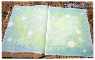
6. Use the Stencil to create circles of Negative Space. I loved my blended Gelato colors, but I wanted to do something before I started doing any stamping. So since I had a new stencil I hadn't tried yet, and I still had a baby wipe in my hand, I decided I'd use the stencil to create some negative space. All I did was use the baby wipe and wipe away color in some circles through the stencil while the Gelatos were still not dry. Gelatos are permanent when dry, but before then you can really play with them, wipe them off, etc. So that's what I did here.

Wipe away color.
Stencil Negative Space
 Now you have Negative Space circles.
Negative Space Circles

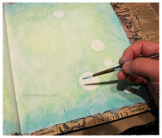
7. Use some Gelatos to add a darker color around the circles. I used the Snow Cone Gelato for this. I just scirbbled a bit on my non-stick painting mat. Got a thin liner paintbrush wet with water and wet the Gelato color a bit. Then I took the brush and just sort of outlined the circles in a subtle way, to help them pop a bit more.

Paint Circles


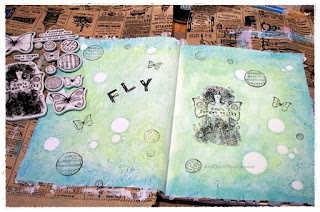
8. Stamping time! Next I grabbed my stamps and had a ball. I did the fairy lady stamp first, then added the circles and butterflies.

Stamped Pages

Fairy Lady

9. Scrape some paint with a credit card. Before I moved on to add some details to the pages, I felt like I needed to see a bit of white here and there. So I grabbed an old credit card and some white acrylic paint and scraped the paint on here and there. I just held the card at and angle and scraped it to hit the high spots of tissue paper.

Scraped Paint

If you look close, you can see it.
Scraped Paint Result

10. Add details and embellishments. I used my Faber-Castell Pitt Artist Pen and my Uni-Ball Signo white gel pen to add details. You won't see them all in the next photo...again, I got so focused on what I was doing that I missed another photo opp. But you'll see them at the end.

Details


11. Add more cirlces using Distress Ink and the Stencil. As I stood back and looked at the journal spread, it just didn't feel finished to me. I liked it, but I thought it needed something more. So I grabbed the stencil and the Faded Jeans Distress Ink and added circles all around the pages. 

Blue Circles

12. Don't Foret to Fly...the happy ending! After the circles were on I was happy. But I did add some thinned out gesso to a few of the stamped circles here and there for some contrast. And then I knew it was time to call this journal spread complete.

Don't Forget to Fly

Final thoughts on this journal spread...

I made mistakes along the way. The fairy lady, for example. When I first stamped her I accidentally moved and the image was blurred. Urgh! But i didn't fret. I simply gesso'd over her, let it dry, added the Gelato colors again, and then re-stamped her. Mistakes happen in art. Sometimes you can fix them, and sometimes you just have to find a way to love them for what they are. I have never re-done an art journal page. To me, however the page ends up when it's finished is how it is meant to be. An art journal is just like a regular writing journal, in my mind. I'd never re-do a page my writing journal--so why would I re-do a page in my art journal? Even though I can look at this journal spread and see a few little "mistakes" that I don't totally like, it's finished and I love it just the way it is.

You have to learn to love your art, flaws and all. An art journal especially is not meant to be perfect, so perfection should never be your goal. Nor should you compare your art (or art journal) to the art of anyone else. Your art journal should always be, first and foremost, your means of creative self-expression. And as such, it can never be wrong. It's Y-O-U!  

Love it.

Love yourself.

And Don't Forget to Fly!

Man in the Mirror

I came across a blog I hadn't seen before that does digital art challenges each week. The blog is called Digital Whisper. This week's challenge theme is "Sheet Music," so I thought I'd jump in and participate. And my favorite musical muse is almost always Michael Jackson, so he inspired this digital art work. And the sheet music I used is from MJ's Man in the Mirror.

Man in the Mirror

I don't seem to do as much digital art as I once did. So I love when I get inspired by a great theme or challenge to make some more. :)  You can see more great digital art from this challenge by clicking on the the blog link above.

Follow Your heART

It was a busy weekend, but I did manage to get into the studio for a bit yesterday and create a new spread in my art journal. Tried some different techniques and fun with with texture by using molding past. 

Follow Your heART

I decided to limit myself to just a few colors, and I wouldn't let myself use pink or red (because I use pink a lot). So I decided on turquoise and brown, and black and white. I started by using a stencil and molding paste on the left and right sides of the pages to create the smaller circles. Then I sprtized some water on the pages and used some Mr. Huey's Color Mist sprays to create the background color. I did this by unscrewing the the spray nozzle and just dripping some color at the edge of the page. The water on the page helped the color spread, and when it needed help I just sprtized some more water on. I also picked up the pages and let it run down toward the center. 

Once that was done I used a stencil and some acrylic paint on a dauber to create the heart. I embellished it a bit with brown at the edges, and then used a white acrylic paint pen to brighten the design inside of the heart. I used a another stencil with brown ink to create the wee small circle textures here and there on the pages, and another stencil to create some small floating hearts. I used my round dauber and the turquoise acrylic paint to put circles on the pages. I created more circles of white using a cardboard tube. Then I just added some embellishment here nad there to various circles...outlining some, adding dots, cross-hatching, etc. When I was happy with the background I finished it off by stamping 'Follow your heArt.' The arrow with writing in it is also a stamp.

I really love how the background turned out in this spread. I hadn't done anything quite like this before so it was fun to do something different. And I love the color combination too. All I knew when I started this spread was that I was going to create texture on the edges of the pages, and that i was going to use the heart stencil. Everything else just evolved as I went on. So that really was me following my heART in my studio. :)

Hope Art Journal Spread

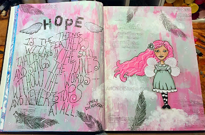
I have a job interview on Wednesday with a nearby school system for a grades 3-6 Art position. I am very excited about the possibility of teaching again. I'm trying not to get my hopes up too high, but I am all about having a little hope and a positive attitude. So my journal spread for the weekend was inspired by that hope.

Hope Art Journal

Hope is the thing with feathers
that perches in the soul
and sings the tunes
without the words--
and never stops at all.
-Emily Dickinson
Here's to hope. And maybe new beginnings.

Moms Day Mini Art

Last week I took Destiny out to the studio for some painting fun. I wanted her to create some mini canvas art for her mom (my daughter) in the style that her mom likes, which is abstract. And since her mom likes neutral colors too, that's what Destiny used.

Moms Day Art

I gave Destiny some brown paint, white, and a creamy tan, along with a brown acrylic paint pen. I also told her she wasn't going to use a paintbrush for this painting--so instead I gave her a cardboard tube, a paint dauber and a stencil. She drew some lines with the paint pen first. Then she used the dauber to create the tan circles. Then she added some brown rings with the cardboard tube. And she finished it off with white paint and the circle stencil. 

I think it turned out fabulous! Granted, I'm a little biased. ;) But it was a fun time in the studio creating this mini canvas art for her mom for Mom's Day.

Inside Art Chick Studio

In honor of Cinco de Mayo (not really, LOL), I thought I'd share a quick collage pic of the work area in my studio. I was really just in the mood to share since I snapped a few pics the other day after I rearranged a few things in there. I think I've posted pics of my studio here before, and I know I have on the Facebook page. But it never hurts to share again, right? So get ready!

Art Chick Studio

In the top left pic you'll see the very edge of my work space, and that's where I store my gelatos. My Inktense blocks are almost always right there too, along with my Neocolor II crayons, because I use all of those a lot. My iPhone dock is there too, so it's always nearby when I want to listen to some tunes. I just added some clear plastic divided storage cubes back by the wall; I added some more craft paints and my new Tombow markers in there, and on top of it are some daubers and various tools. I also have my smaller stencils hanging off the lower shelf, along with some blank tags that I add stuff to from time to time--like when I need to clean a stencil, or dab off a dauber or blender. I learned that trick from a Dyan Reavely video. She is awesome!

In the top right pic you see the main work area, jam packed with artsy goodness. My gessos and mat medium are there, along with my large variety of paint pens, Pitt artist pens and gel pens. Then there's also my main stash of craft paints, and my other acrylics are hanging from the shelf above. You'll notice that my counter space is just wood--MDF, maybe? The Hubs always meant to put a counter top in there for me. But once I got working I could never manage to clear out of there long enough for him to put any sort of finished counter in. So I just work on the wood. Since we're going to be moving out to our farm property at some point (hopefully soon), I don't see any point in bothering with counter now. We'll save that work for the new studio out there. You can also see the start of my paint brush hoard in the right corner there too. Up on the lower shelf is a variety of mediums; and to the far right (starting at the mint green binder) is clear acrylic stamp storage. I keep some in the binder, some in the accordion file on the end, and some in the smaller storage things in between.

The bottom left pic is actually to the right of my work space in the studio (it's an L-shaped counter in there). The white shelf unit is where I keep all of my rubber stamp ink pads, distress inks, sprays, and various adhesives. The counter area there is actually a large built-in light box that the Hubs made for me. It is AWESOME! But it's often covered with art books, palettes, paper towels, and whatever else I need handy at the time. I do use it, which makes for some not-so-fun times when I have to move everything to get to the light box, but oh well. And yes, that's Ian Somerhalder staring at me in the photo. Nothing wrong with having that face to look at when I'm in the studio, am I right? Angelina is in there too--because I just love her face--and if you look very carefully you may spy Nicolas Cage in there too.

The last photo on the bottom right is my aqua utility cart from Ikea. Love that thing! I keep my big stencils on there, my scissors, baby wipes, my most used paintbrushes, more adhesives, stickers, daubers, texture/journaling supplies, and various drawing pads etc. Basically it's for the stuff that I use a lot and what quick access too; but I also want to be able to move it out of the way in a hurry when I need to. It's great for all of that. I may get another one when we move to the farm, because my studio will be much bigger. Yay!

Well, I hope you enjoyed this little peek inside my studio. Hopefully within the next year or so I'll have a brand new studio to share with you. Preferably one that I let the Hubs finish the counter in before I move all my stuff in! I can't wait to move. Sigh. But I'll keep creating in the current Art Chick Studio in the mean time. :)

Let Love Grow

I was in my studio on Saturday instead of Sunday over the weekend. That was a nice change. It left my Sunday free to spend with my husband on a beautiful Spring day. I was thinking about flowers this week--hoping to plant some soon. So that is what inspired this week's art journal spread.

Let Love Grow

Lots of Mixed Media here. I used acrylics for the background; I first rolled on my two blue colors with a brayer, then scraped them on with a credit card, and finally used a baby wipe to blend the color in some areas. I used a stencil in the background too, and some acrylic paint pen. The flowers were created with a combination of acrylics and Neocolor II crayons, markers, and a touch of black ink. The lettering was stamped on with clear acrylic alpha stamps.

Let Love Grow, y'all!

Blue Fairy Art Journal Spread

It was a beautiful Spring day yesterday and I spent it painting in my studio with a cool breeze blowing in on me. It was wonderful! Spring truly is my favorite season of the year. And as I was in the studio, a fairy came to life in my art journal.

Blue Fairy

I used another technique from Jane Davenport's book, Beautiful Faces, this time using Gelatos to scribble in colors on the face and then blend it with gesso for a more painterly effect. I did the background with a stencil, and some sprays from Dyan Reavely. I also stamped on a few flowers too. 

Notice that I did blue hair this time, instead of pink! :) It was a wonderful, creative day!

Butterflies Art Journal Spread

This weekend's art journal spread was brought to you by the beauty of butterflies. They are such beautiful little creatures, aren't they?

Butterflies Art Journal

The background on these pages was created using Inktense blocks. The large butterfly is a die-cut that I've enhanced a bit with Inktense and ink. The flowers were created with mixed media: Inktense and clear gesso for the centers, my fave black pen by Scarlet Lime for the petals and details, and a white Uniball Signo pen for the accents. I also used a little bit of Gelato to create shadow for the large butterfly.

I love this color combo on the pages. It was a dreary, rainy day yesterday--so I just wanted to bring a little sunshine into my studio. :)

Pink Roses Watercolor

I thought I'd share a watercolor painting that I did several years ago but never posted. I was looking at it today and decided it would be fun to share it. Who doesn't love roses, right?

Pink Roses Watercolor Painting

I used rubber cement on this as a resist, to create the white outlines. It's just a different technique that I had wanted to try--something different. This piece actually hangs in my bathroom and the colors and roses match the theme I have going on in there. I've never been able to grow roses well, so it's nice to at least have some to look at that won't die after awhile! :)

Beautiful Faces

I recently bought a wonderful book by Jane Davenport called Drawing and Painting Beautiful Faces. Now, I already know how to draw and paint a face, so I wasn't in need of a how-to book on the mechanics of it as such. However, I'd seen enough of Jane's videos and blog posts etc to know that she does awesome faces and I love her style. And I always love to learn new techniques and new media. So when I saw her book suggested on Amazon, I bought it right away. 

Beatiful Faces by Jane Davenport


Let me just say that I truly LOVE Jane's book. She does provide instruction on how to draw a face and its features. But even better, she shows you how to draw and paint faces using a variety of different media. This is exactly what I love! I may have an art degree and I may be an artist myself, but there is always, ALWAYS, media out there that I haven't used, and different techniques that I haven't yet tried. And Jane's book provides lots of ways for me to do just that. She shows--with lots of step-by-step photos--how to do faces with Pan Pastels, Copic (or Tombow) markers, colored pencils, acrylics, and more. She also lists all the media she uses with each technique. 

The technique I tried over the weekend was one I hadn't tried before, and it was her Glazing technique (on page 98, in case you're wondering). It was a little scary--it always is when I'm doing something new. And Jane even said of this technique that it would have an "ugly duckling" phase in process, and it sure did! But when my face was done I loved it! Here are a couple of photos; the first was my initial drawing and the second is my finished face.

Beautiful Face Journal Page

Beautiful Face Painted Journal Page

Glazing is the use of a medium mixed with paint and then building up the layers of paint to create a finished painting. I used matte medium to create the glazes and followed Jane's instruction for this technique. I even used the art journal recommended by Jane in her book: it's a Strathmore Series 500 Mixed Media Art Journal. It's hardbound and the paper is deliciously thick and perfect for mixed media. I can see why she recommended it and it will surely become my new favorite art journal! I love how my face turned out. I don't think I'm done with the page yet; I'll probably add a background of some sort next time I'm in the studio. But I think this is a great first entry in my new art journal!

So anyway, if you're wanting a great book to help you either begin to draw and paint faces, or just to learn some new techniques and media you may have not tried before, then I highly recommend Jane's book, Drawing and Painting Beautiful Faces. I would absolutely give it 5 out of 5 stars! And it's going to be a treasured (and well-used) book in my art book library.